The Van Helsing website was a bit closer to mine then the shark tales one in terms of colour and theme. I used the one and compared to the shark tales one in terms of colour and how they lay out movie that are completely different. One of the most obvious things was the colours, Van Helsing is the opposite of shark tales, it's dark, dangerous, violent, nobody dies in shark tales and nobody gets seriously hurt except for Franky and the show that in a way that is almost funny by making Lenny cry and wail and then have Oscar freak out and act all silly. The point is that the sites are all like reflections of the movies, and this is what they need to be, they need to give the audiences and idea of what they are going to see when they watch the movies.
Site: http://www.vanhelsingmovie.com/home.html
Tuesday, November 10, 2009
Shark Tales
The shark tales movie website was the second one i looked at, i looked t it because the type of movie that shark tales is, is so different and bright and cartoonish and i wanted to see how they would create a website like that. I found the character part on the site interesting, if i had lots of time to work on my website and the right equipment i think adding the voices of the characters underneath their pictures would have been a great idea.The whole site is laid out and themed really well, the colours are all bright and they all match the movie, it also uses the underwater theme very well like the border for the trailer link.
Link: http://www.sharktale.com/main.html
Link: http://www.sharktale.com/main.html
Saturday, October 31, 2009
Problems
I have run into a few problems, the first was when the title and some pictures kept going behind the picture i was using as the background for my website, even though i had sent it to the back over and over again. So i had to get the teacher to help and he found out how to use an image instead of a colour as the background which pretty much fixed up the problem. Another thing was that when i published my site to check it the links at the top of the page weren't working but only some of them and only on some pages. The links weren't the same ones either. Finally i figured out that it was becuase the image which i had used as the title on all of my pages was at the top and for some reason when the site was published it brought it in front of the links so i couldn't click them through it. To fix this i just most down all the things but the links on each of my pages.
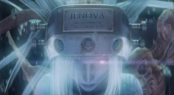
Jenova Page
I was originally going to put Jenovas profile on the character page with the rest of them but i didn't really think it fitted well and there was a lot more i wanted, or really needed, to put with Jenova to explain her. So i gave Jenova a whole page, it's the only page with a different background, just black instead of the picture. But it still has the little edges around the picture and the matching stripe down the bottom, just a different colour, so it still matches the rest of the website.
Character Page
The Character page was a little hard because at first i wasn't going to put everyone in, i thought it would be to big but one of my favourite characters isn't one of the main characters so in order to put her in i had to put the whole team in. But then again it still looks pretty awesome and it was fun. I also learn't a few things from writing the short blurbs about them, such as the fact that Marlene was Barrets adopted daughter, i never knew that.
Website
So this term in Creative Madia our task is to create a website and a poster, as well as a trailer if we have time. At first i was going to create a website about the Chunin exams in Naruto but it was to hard to create an awesome wesite with colours that matched what was actually in the episodes so instead i chose to create my wesite on Final Fantasy Advent Children which is totally awesome and i can't believe i didn't think of that first. Anyway for what i wanted to put in my website i thought a page for the trailer, a homepage, a characters page, a Jenova page and mabye something else like weapons, oh yeah and a poster page.
Subscribe to:
Posts (Atom)